Crowded Wishlist Clarity
Adding a feature to an existing product, Steam, showing I can work within an existing design framework.
Introduction
Background
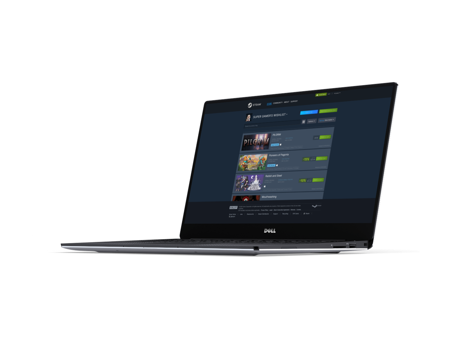
Steam, developed by Valve, is the world’s largest PC gaming platform, connecting millions of players globally. With over 62 million daily active users, it allows players to buy and play games while also providing a "wishlist" feature to save games for later purchase.
Project goals
Give users the ability to arrange their wishlist as they please
Help the user view more items on their wishlist
Completion time
3-week project completion
My role
Product designer and researcher
Tools

Skills
User Research, Ideation, Interaction Design, Design Systems, Wireframing, Prototyping, Testing
The Solution
After gathering both primary and secondary data, I designed improvements to the wishlist system, enabling users to create and categorize custom sub-lists. Additionally, I introduced a grid view option to allow users to quickly display more products on-screen.
Research
Research Objectives
1. Determine what goal having a wishlisted product accomplishes.
2. Understand how wishlisting affects the likelihood of purchase.
3. Understand the process of bookmarking and coming back to products in ecommerce.
4. Learn if there are triggering events.
Secondary Research
Exploring bookmarking features across various storefronts broadened my focus beyond the video game industry. I found greater value in studying e-commerce platforms with well-developed wishlist systems, offering valuable insights that can inform and improve our design.

“My List” system allows you to make your own bookmarked categories

Curated bookmark lists to fit themes and needs
You can view in a list or a grid
There is no option to bookmark a product from the
thumbnail


There is an option to bookmark a product from the thumbnail and homepage splash images
Has generous filtering options in the wishlist
Cannot manipulate the order of the wishlist
Wish listed items have very minimal info

The full listing of necessary information is supplied in the “watch list”
Filters based on category exist to make it easy for a purchase or auction decision to be made efficiently.
You can view items related to the item you have watched as an extension to the “watch list”
There is an option to bookmark a product from the thumbnail
Primary Research
Primary research was conducted between user surveys and interviews.
I interviewed 5 Steam users.
I received 9 responses to my survey.
Survey Results
Out of 9 responses to my 8 questions, here are some of the replies and statistics that influenced our design decisions:
How would you rate your experience finding products directly through the wishlist system on Steam?

How would you rate your experience purchasing a product directly through the wishlist system on Steam?

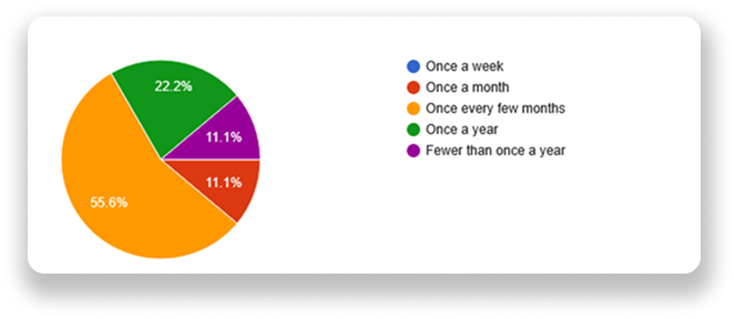
How often do you buy new products from your wishlist?
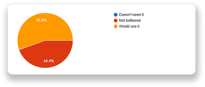
How would you feel about the wishlist adding a grid view option?
Adding products you wish to purchase for a friend as a gift in a separate part of the wishlist. It's easier to keep track of games on sale you want to buy for friends on your own wishlist than looking through someone else's.
Any suggestions to improve the current wishlist experience?
I also would like to sort games by genre by clicking on a tag from a selection based on the games in your list. Would prefer it over a customizable list as suggested below, although if that option was present I see myself using it depending on implementation.
A grid view as suggested below is something I always would have wanted in the wishlist as you would quickly get an overview in case you're looking for something specific, or just browsing.
Mapping Our Results
Using an affinity map, I organized common themes and identified patterns to define the problem. I supplemented my interview findings with secondary research to provide additional insights.

3 out of 5 participants preferred the bookmarking systems of other storefronts, which emerged as the most significant finding from our interviews and heavily influenced our decisions moving forward.
Personas
Two personas were created to capture the needs of two potential users based on the research above.

Sophia - A semi-regular gamer and interior designer from Chile, she wants a way to organize her wishlist that helps her remember the reasons behind bookmarking each product.

Jake- A frequent gamer and construction worker from New York, he has a densely populated wishlist and struggles with the system’s visual clarity when dealing with high item counts.
★ I would like to help users with large wishlists navigate their pages with more efficiency because they cannot effectively locate items they wish to buy from the current bookmaking system.
★ I would like to improve a user's experience in sorting their own lists because users are finding categorization options are too few.
★ I would like to assist users that are used to bookmarking systems on more mainstay platforms have the freedom of customization in the wishlist system because they are already accustomed to these options.
Point Of View Statements
How Might We Questions
➢ How might we How might we improve the clarity for users with larger wishlists?
➢ How might we How might we provide the user with better sorting options in the Steam wishlist?
➢ How might we How might we give users more freedom when bookmarking products?
Ideate
The Vision
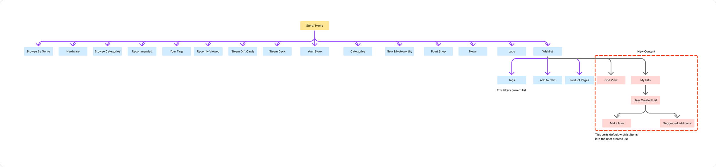
Site map covering Steams already existing features following our changes and additions.

Task flows designed for both features to be added.
Low Fidelity Wireframing
Using the research I gathered, I sketched out my first low fidelity wireframes of the new features I intended on adding.


Mid-Fidelity Wireframing
The mid-fi wireframe was made into a fully functioning prototype to use for our first usability tests.

Design
High Fidelity Designs

I transformed the wireframes into a closer representation of the final product. At this stage, I was ready to integrate interactions and begin usability testing.
Screens Completed include:
Onboarding for the new feature set

Grid view to show more products on screen
A custom list creation system
Created list examples
Selection of products to be added in both list and grid view

Interaction Design
Before the design can be sent to potential users for testing, it needs to be responsive and feel as closely as the final product should feel.

Iterations
Usability testing
Number of Participants

5
Goals
To expose weaknesses and pain points in the design
To understand a users’ exploration and navigation of the features
To gather feedback and improve the UI design
To monitor users’ interactions
Key Results

2 out of 5 participants immediately skipped onboarding accidentally and as a result, took measurably longer completing the list creating tasks.
Dead end was found
4 out of 5 participants said they would use the grid view over the current browsing system.
4 out of 5 participants ran into inconsistencies in design between lists
All participants request a way to see what you have selected/ how many items you have selected when not hovering an item

3 out of 5 participants expressed eagerness to have the list feature implemented to Steam in the future
3 users expressed gratitude towards the ease of use and clarity of the product
Quotes
The features feel like they should already be on the Steam client.
The grid view would be my prefered method of browsing.
I would use the list feature if it existed!
Improvements
Improvement #1
Users encountered difficulties navigating to and creating lists if they skipped the tutorial. To address this, I added an option to revisit the tutorial and highlighted the "Create" button to improve visual hierarchy.
As you can see, the menu feels much cleaner and easier to approach.

Improvement #2
Users requested a way to see already selected items.
Here is the before and after of those screens being changed according to feedback.

Improvement #3
I fixed inconsistencies with the header not matching the original wishlist viewport. It isn’t visible here, but in prototype it makes sense.
Now the profile picture and header text scrolls with the header, and it is all correctly layered and prioritized.
I did this for every frame we have the wishlist on.
Here is a screen showing these changes.

Visual Demonstrations
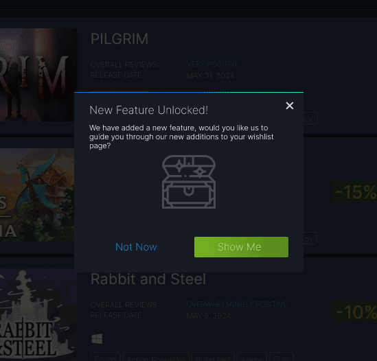
Onboarding for the new features was created using overlays and modals. I used iconography and language closely related to the product’s brand identity.
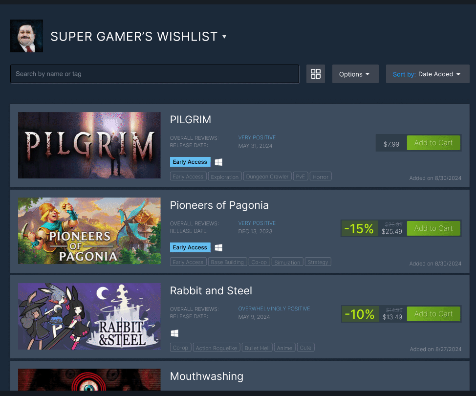
Creating a unique list from your default wishlist couldn’t be any easier than what you see from this demonstration.
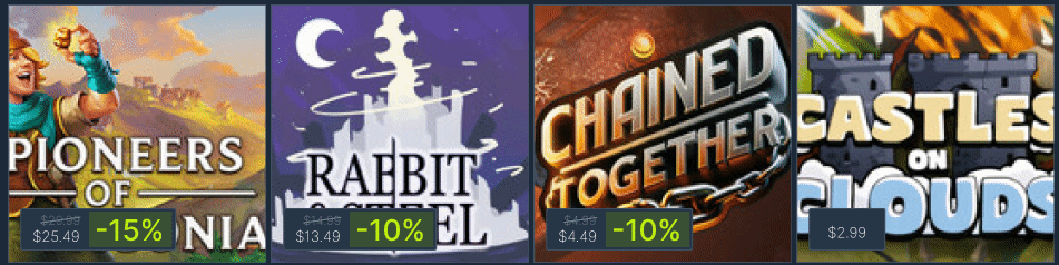
The grid panels have all necessary information for a user to make an informed purchase. Before hovering it shows the price and current discount value over the product
Final Thoughts
In this project, I worked with an established brand and its existing UI styles, which provided valuable experience in matching these styles and ensuring my additions blended seamlessly with the overall design.

What I Learned
Scope creep and prioritization
My original plans and ideas were much larger than what I ultimately produced. While working on the low-fi wireframes, I realized there were features I could scale down to save time and streamline the process, allowing me to complete the assignment more efficiently.
In the future, I’ll keep in mind that the ideation phase can be more flexible and tentative than I initially understood.
Research skills
As an existing user of the application, I was able to navigate the appropriate forums and message boards to gather feedback relevant to the section of the site I aimed to improve.
Since this was my second experience interviewing participants, my interviewing and questioning techniques felt much more fluid. I was also more comfortable extending conversations to extract the key insights from participants.